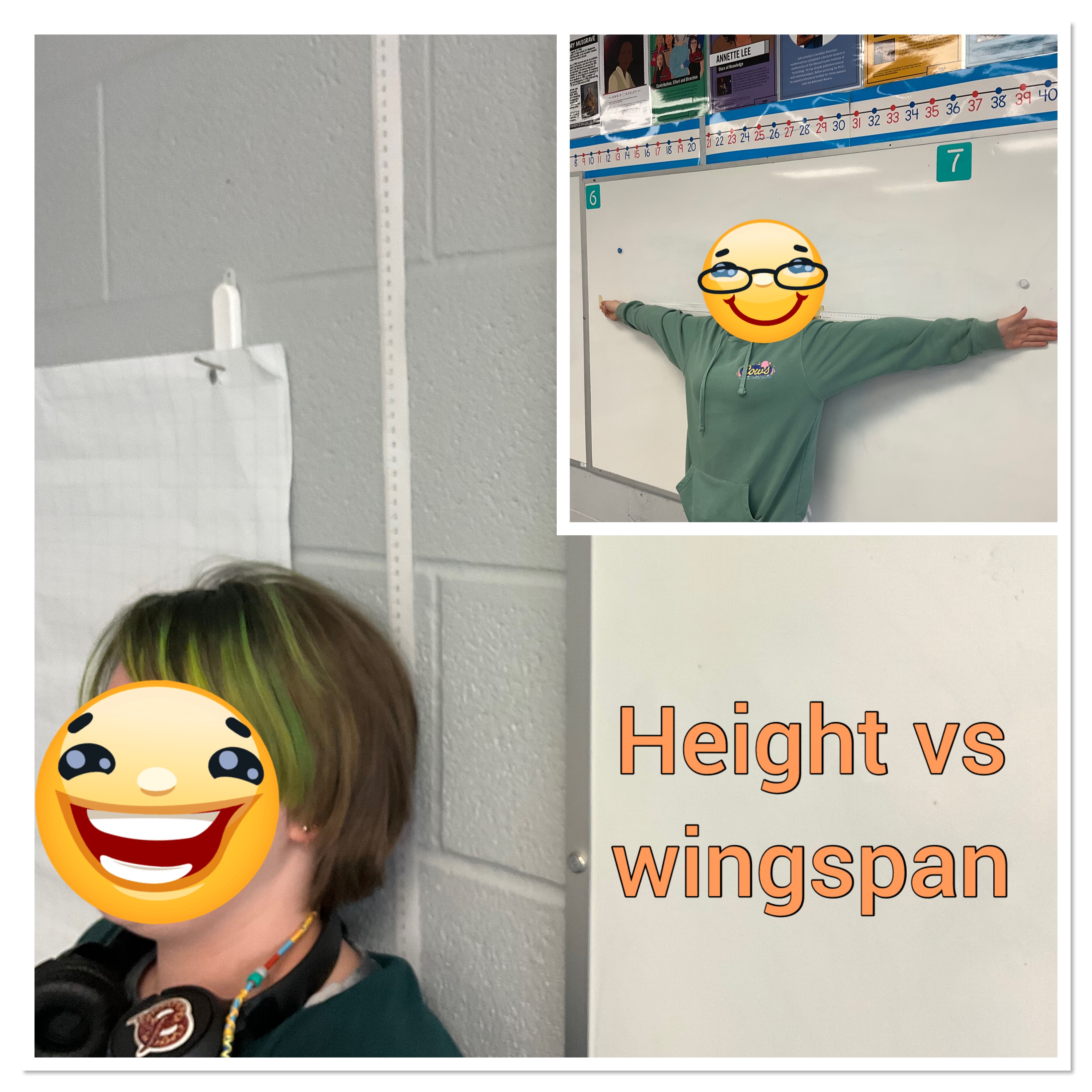
Height vs Wingspan
Today my class explored how to make a scatter plot with a spreadsheet. We collected data of our height and our wingspan.
Next we put our data into a spreadsheet, shared it with the class, and everyone practiced making a scatter plot of the data.
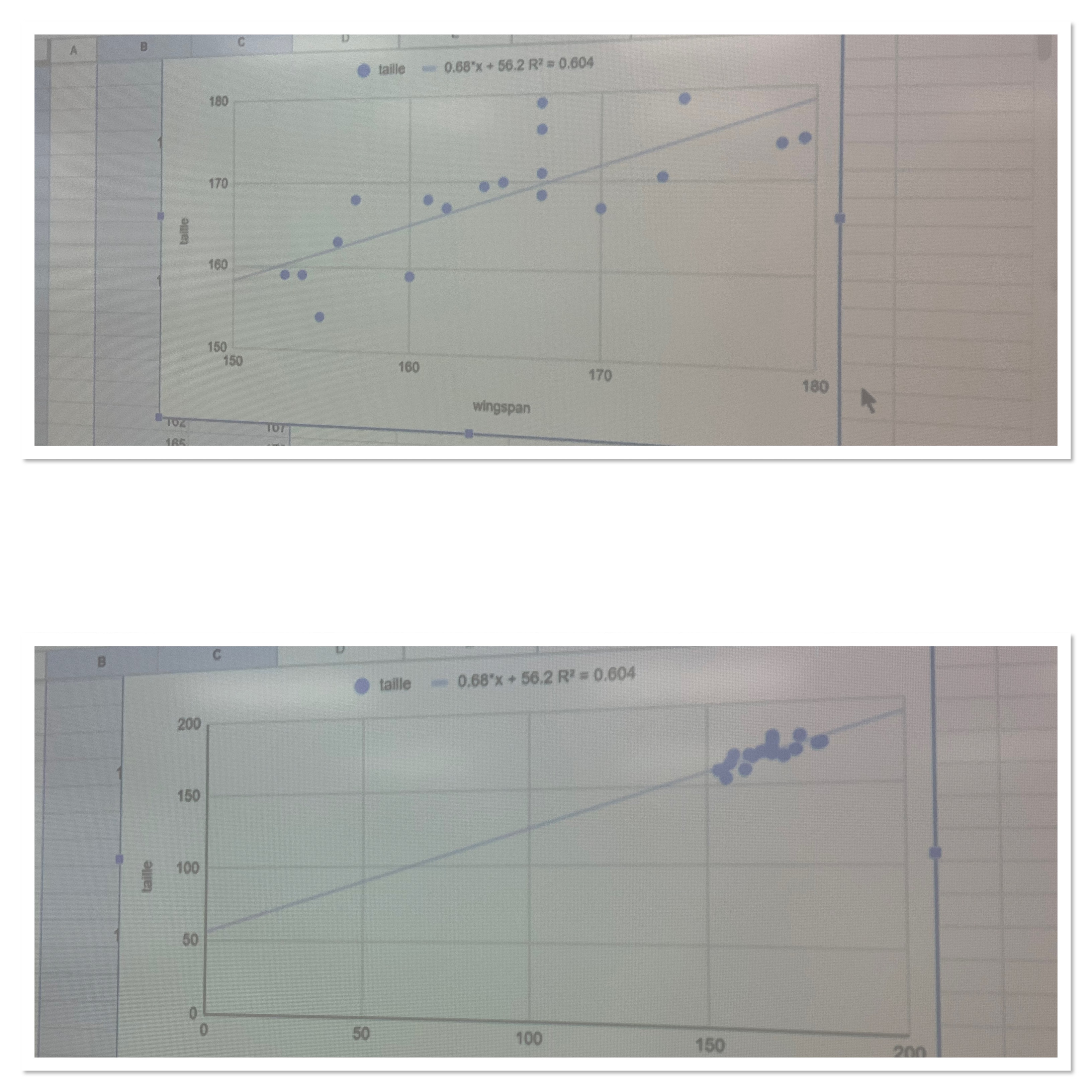
We noticed how if you change the scale on the axes the data can look quite different. We looked at how the R^2 value will tell us how strong the correlation is. We looked at how to make a line of best fit, and how to use the graph to interpolate and extrapolate, and also how we could use the trendline equation to help as well.
We will be making use of these skills over the coming days. We are going to be graphing out multiplication data.
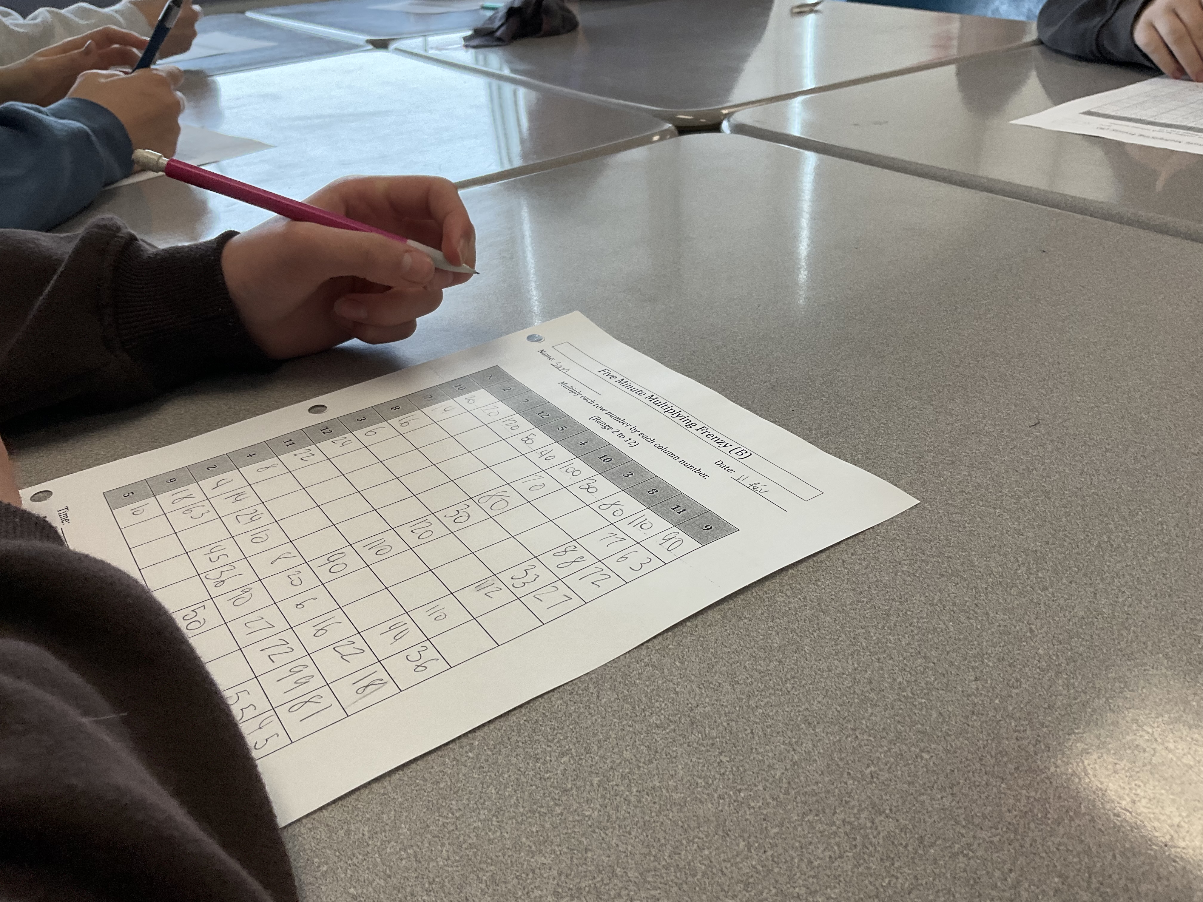
We’ve been collecting multiplication data for the last few weeks. Each day we try a 5 minute frenzy multiplication challenge, and each day we do number talks about different multiplication strategies. With practice, skill building, and repetition we notice that in general we can improve how many we get right, or how fast we can complete the grid. We track many variables in a big table of values, and in the end we will each make a choice about which variable is the most interesting to graph. We’ll make scatter plots by hand and with a spreadsheet.
