Graphing Pumpkin Data
We looked at our data today. We used google sheets because of how easy it is to insert formulae into cells to calculate more things from our data.


We noticed one data point for circumference was really off, graphically it was separated from the others. We learned the vocabulary for outlier (valeur abbérante)
Our graph showed a weak negative correlation for circumference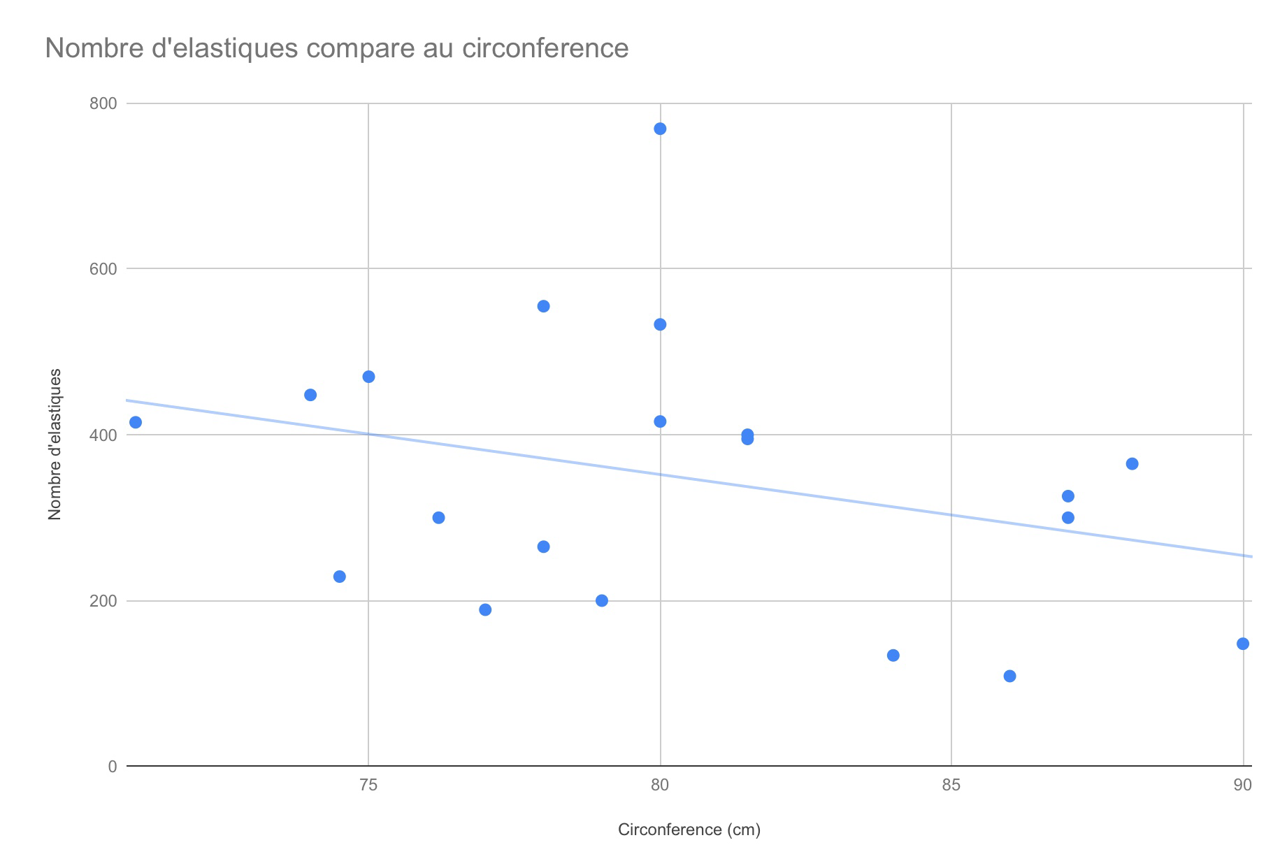
The graph with thickness showed a weak positive trend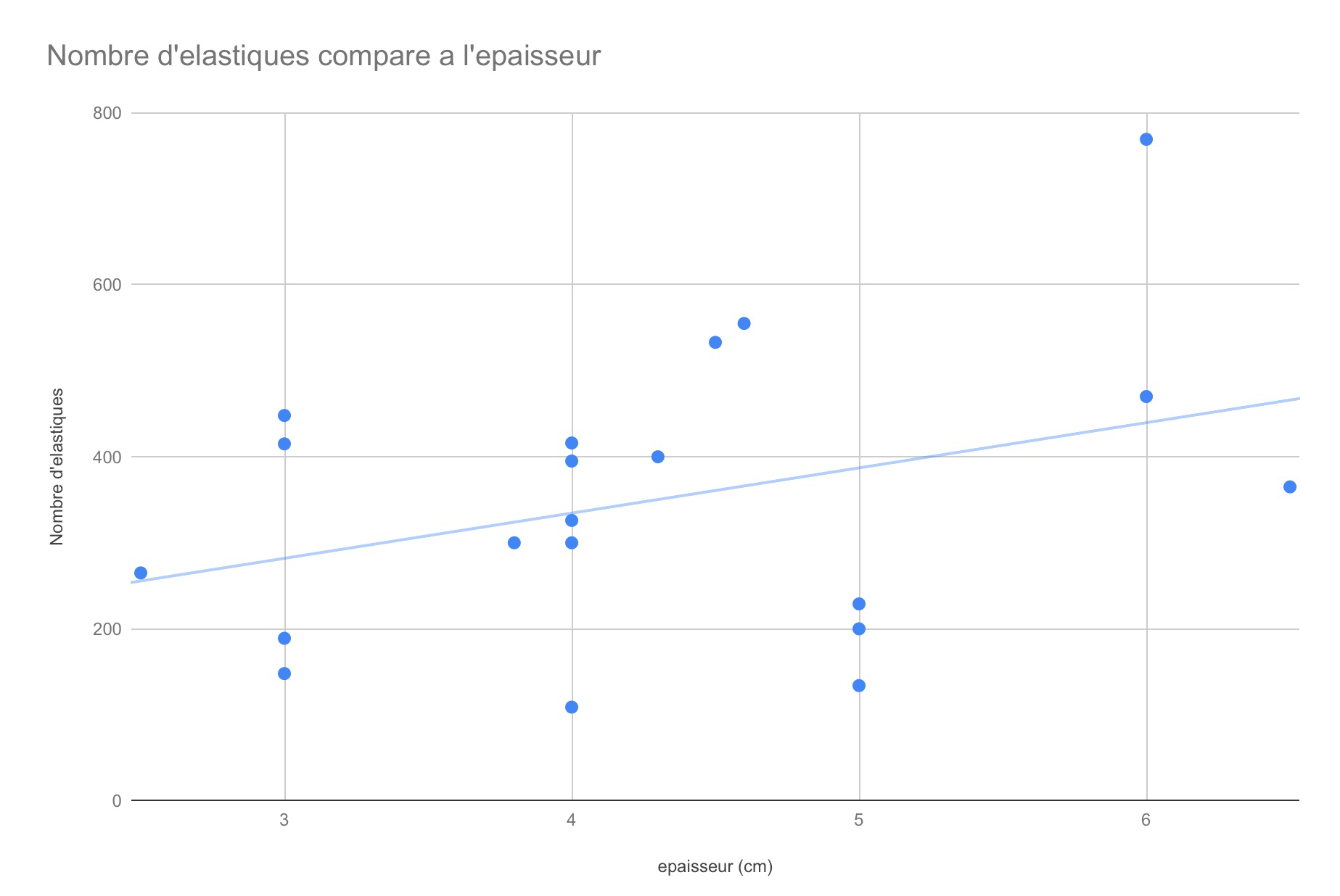
And there was no real trend visible with the height of the pumpkin.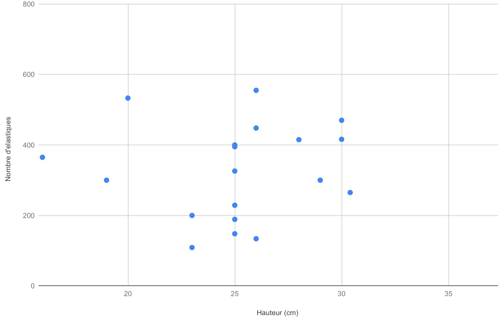
We explored how to enter a formula in a cell to calculate the radius from the data for circumference, and from that we can calculate volume, area, cross sectional area, and try to find more strong correlations.
We noted that we didn’t have pumpkins that were the same variety, also we didn’t apply the elastics consistently among all groups, which led to more variation.
