Cheerio Graphing part 2
Grade 9s continued with their graphs from yesterday.
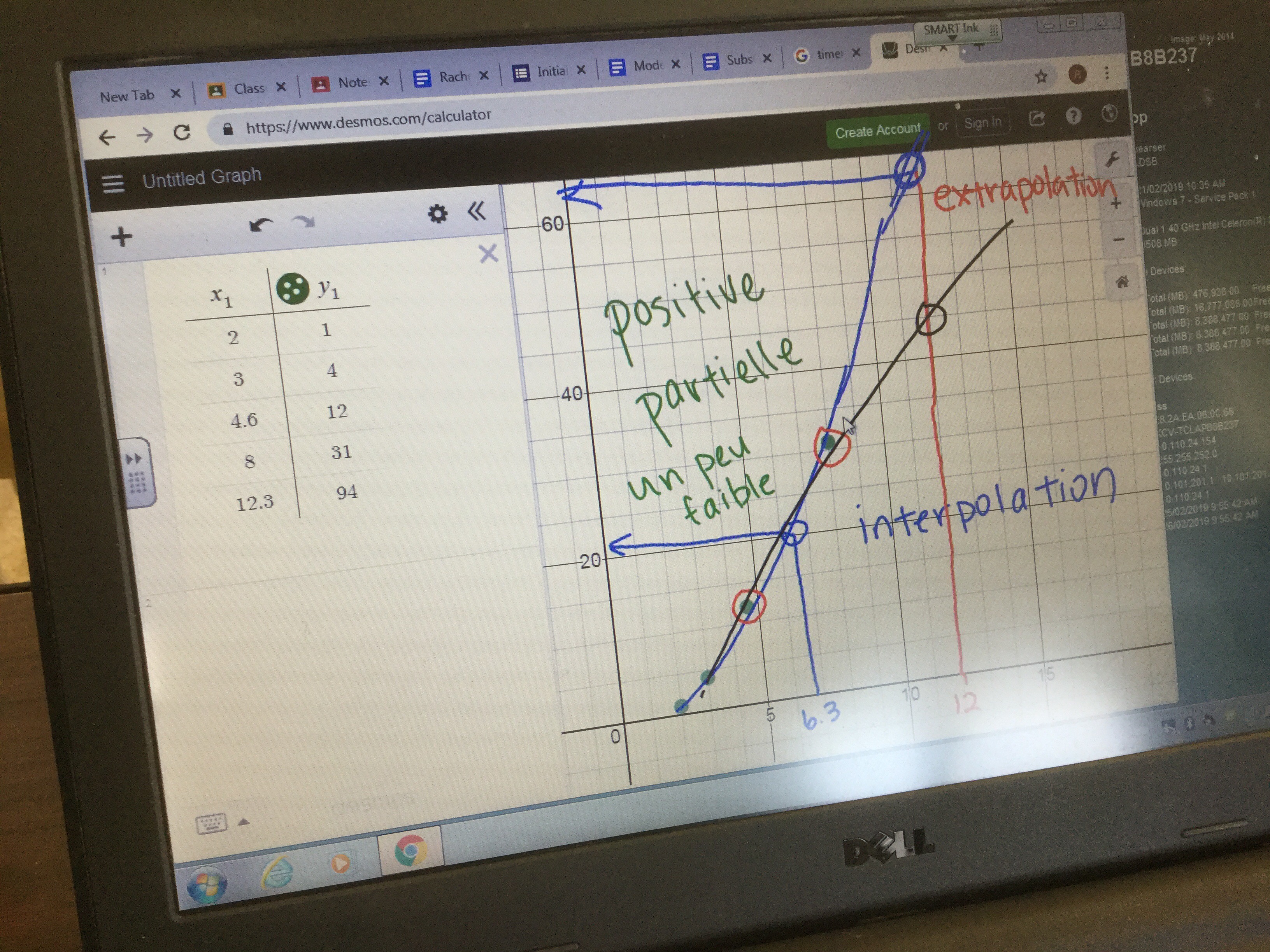
Some decided their graphs looked linear, and so they drew lines of best fit to model the trend.

Others weren’t exactly convinced the trend would be a straight line, so they added lines or a curve of best fit to model how the trend changed.
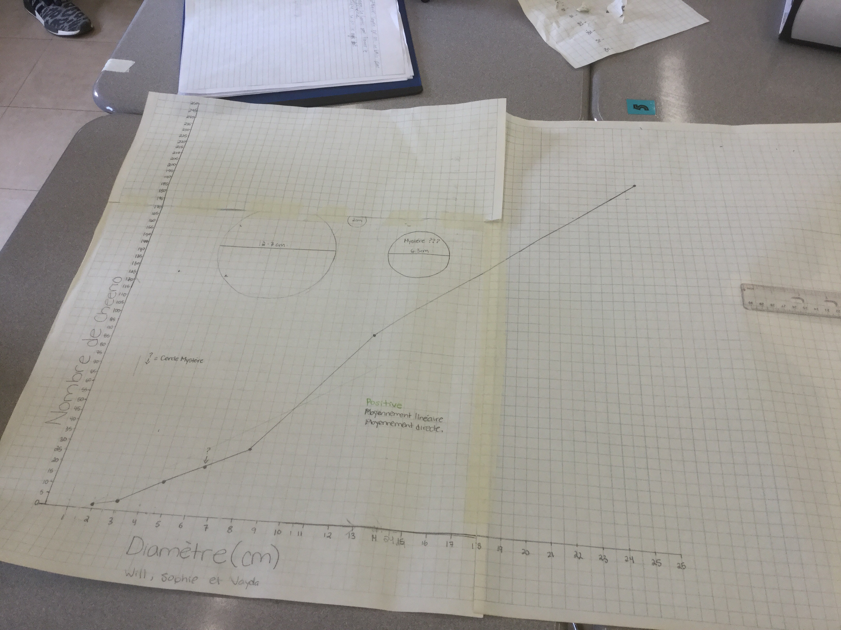
After everyone had their graphs, the goal was to predict how many cheerios would fit on two mystery circles. One was a small circle, (that fell between data points on the graph), and another was really big, bigger than any other circle we had filled before.
Estimates for the big circle ranged from 160-300 cheerios based on our various graphical models.
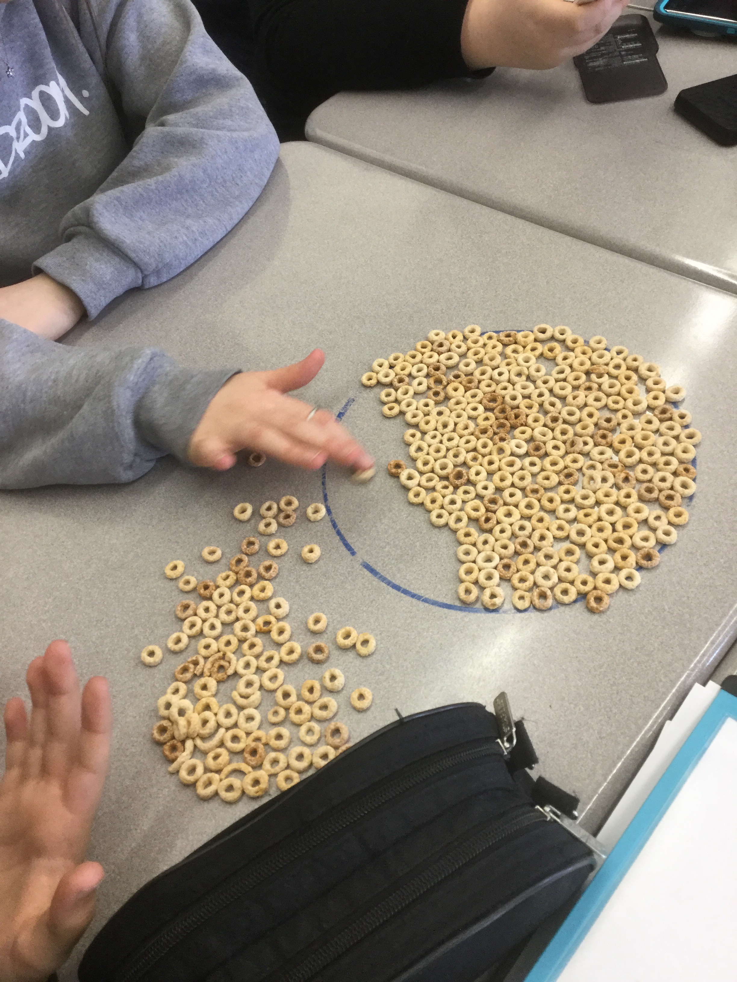
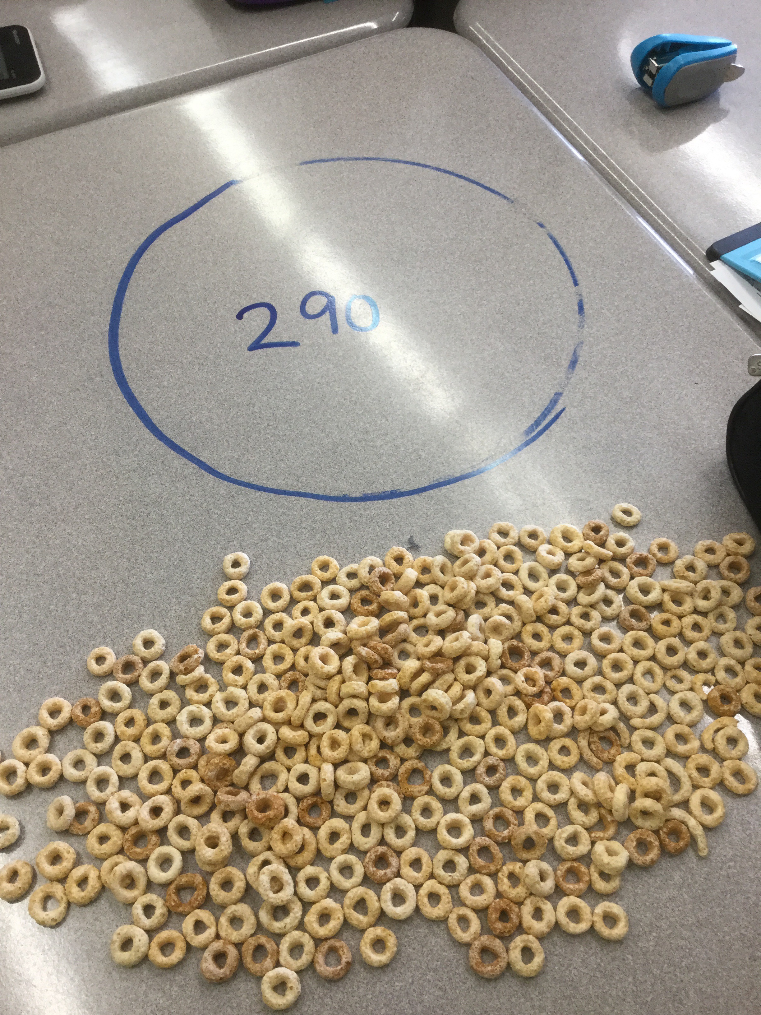
To see how close our estimations were, we filled the circle and counted.
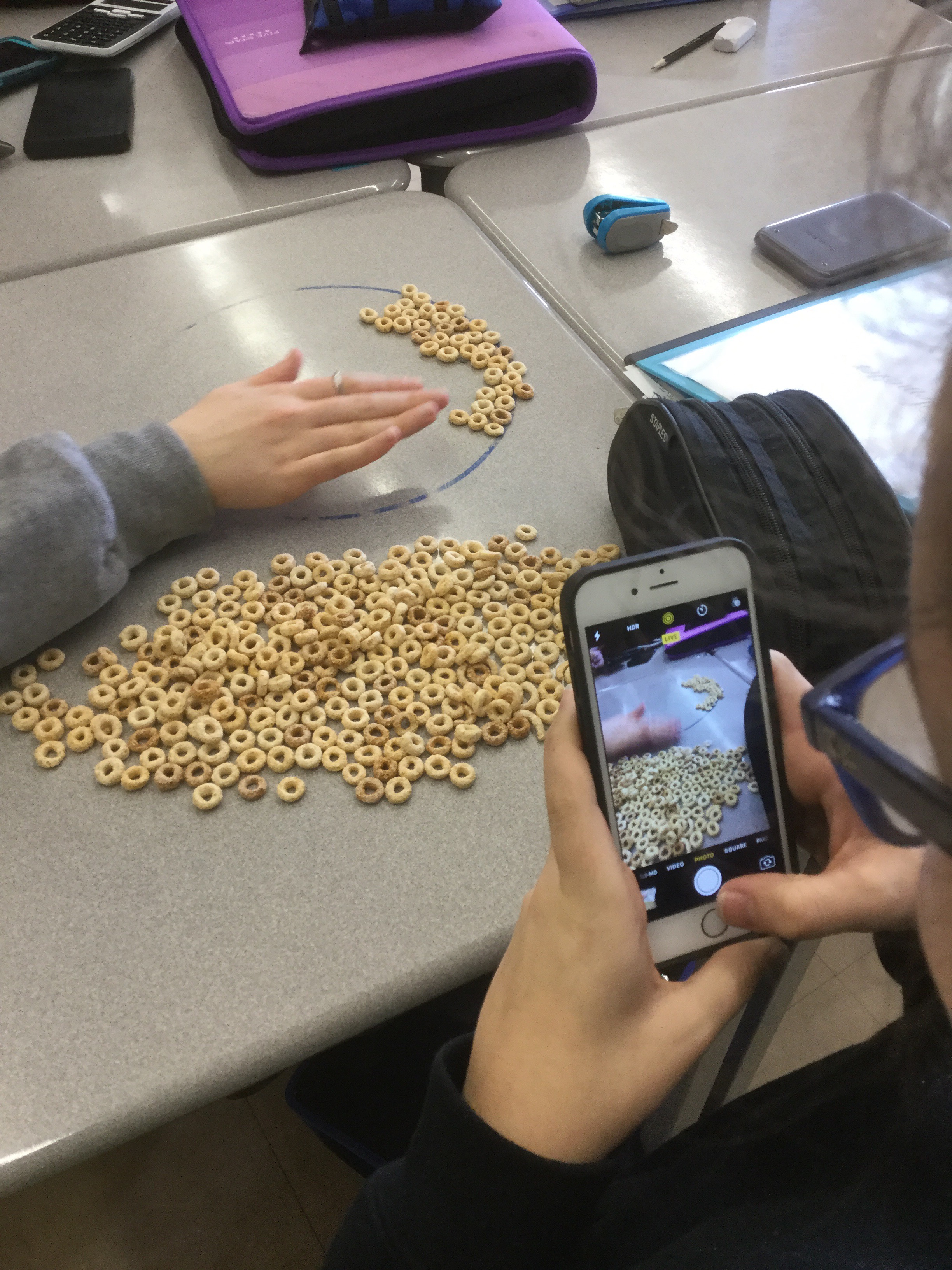
Our total number of cheerios was 290
We learned a few things while working on this activity.
- Graphing by hand is tedious!
- When you need to use your graph to make a prediction of a larger value, you may need to make your graph bigger, and use a lot more paper.
- Desmos scales the graph for you, and errors are fixed quickly.
We also learned that we can estimate within our data range with pretty good results. This is called interpolation. We had less success estimating outside our data range (extrapolation), which had to do with our choice of model and whether we used a line or curve of best fit.
We will continue to do experiments and graphs this week to get more comfortable with scatter plots.
