Math Carolling
To celebrate the end of tests and investigations, and the approaching holidays we went math carolling today.
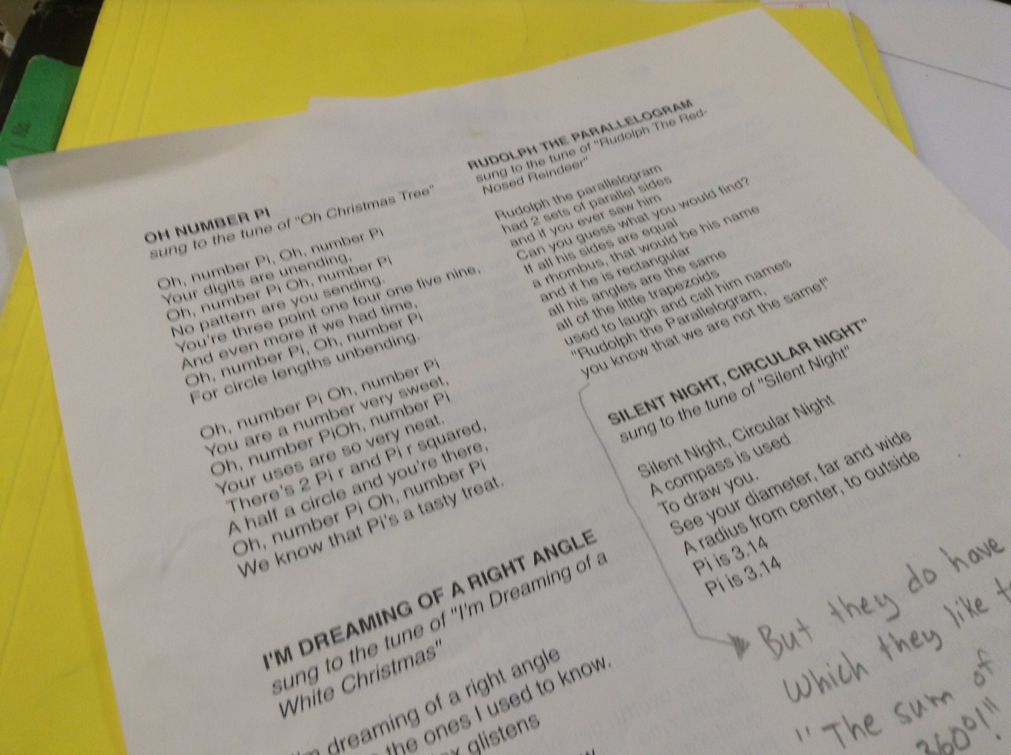
We went to lots of classes, and also to the office to sing for the principal.

This has become a tradition for my classes, and often there are kids in other classes that sing along when we come to their door.
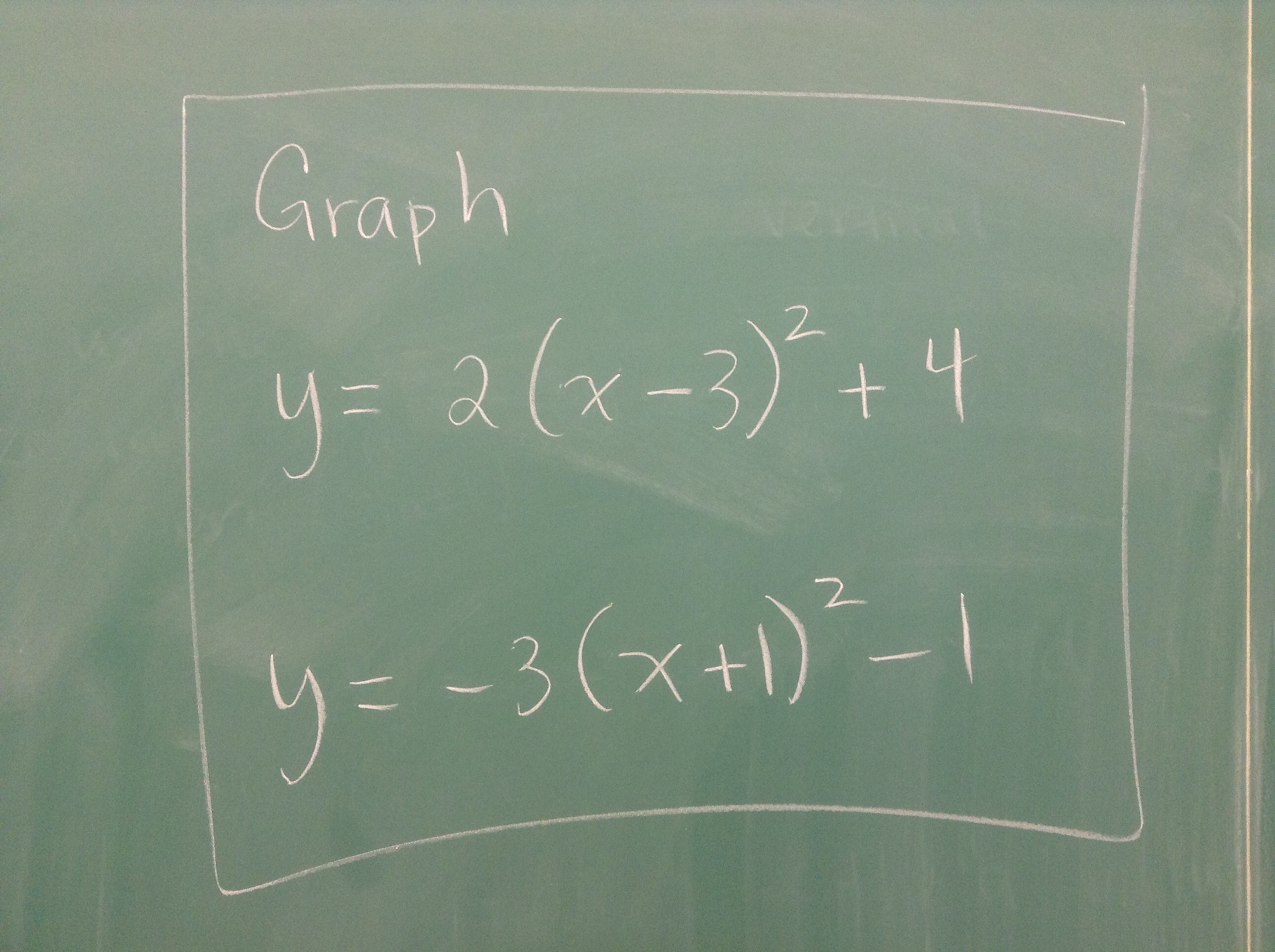
Parabola review

Grade 10
Graph using transformations
Completing the square
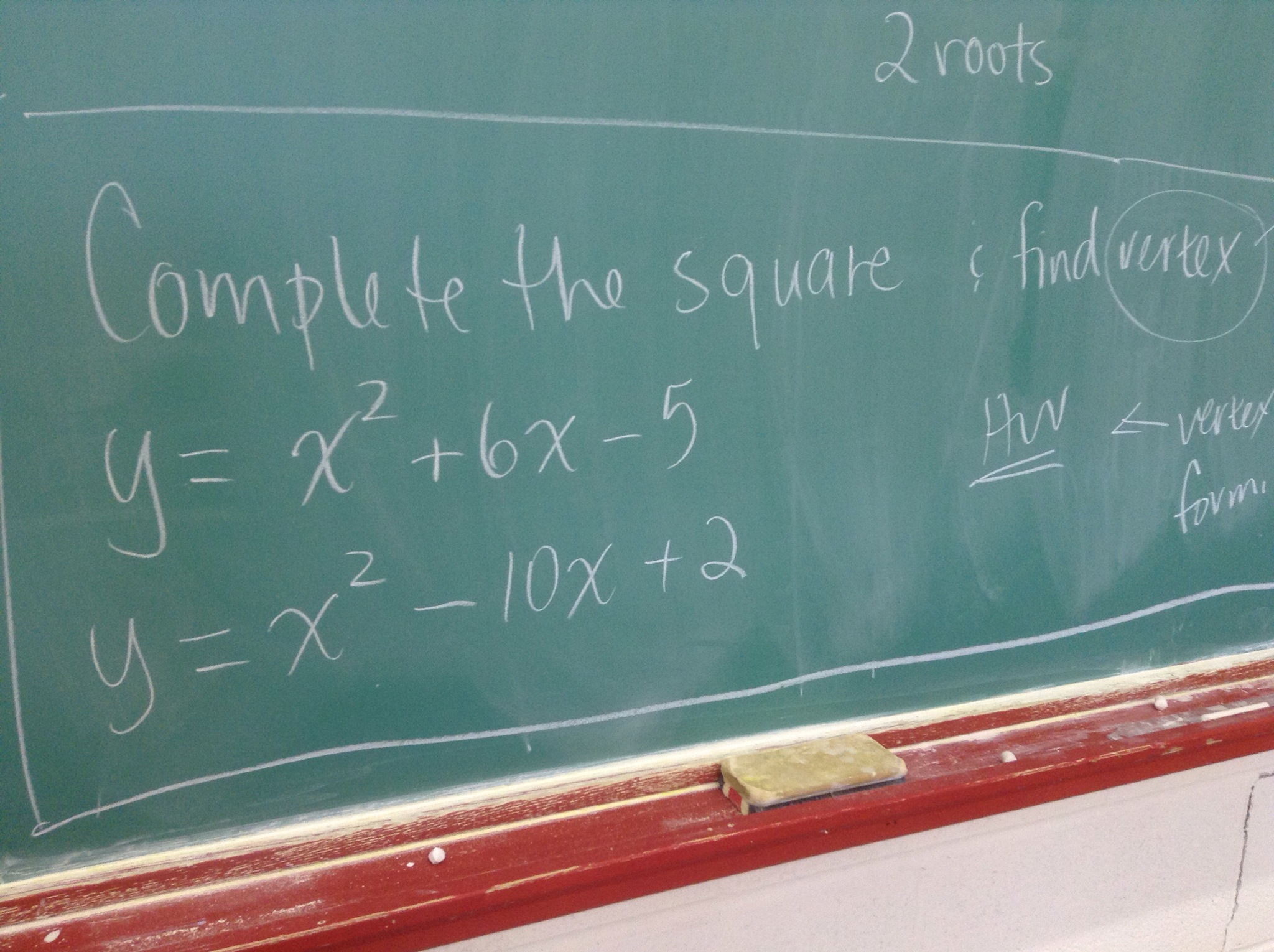
Homework for today, grade 10s
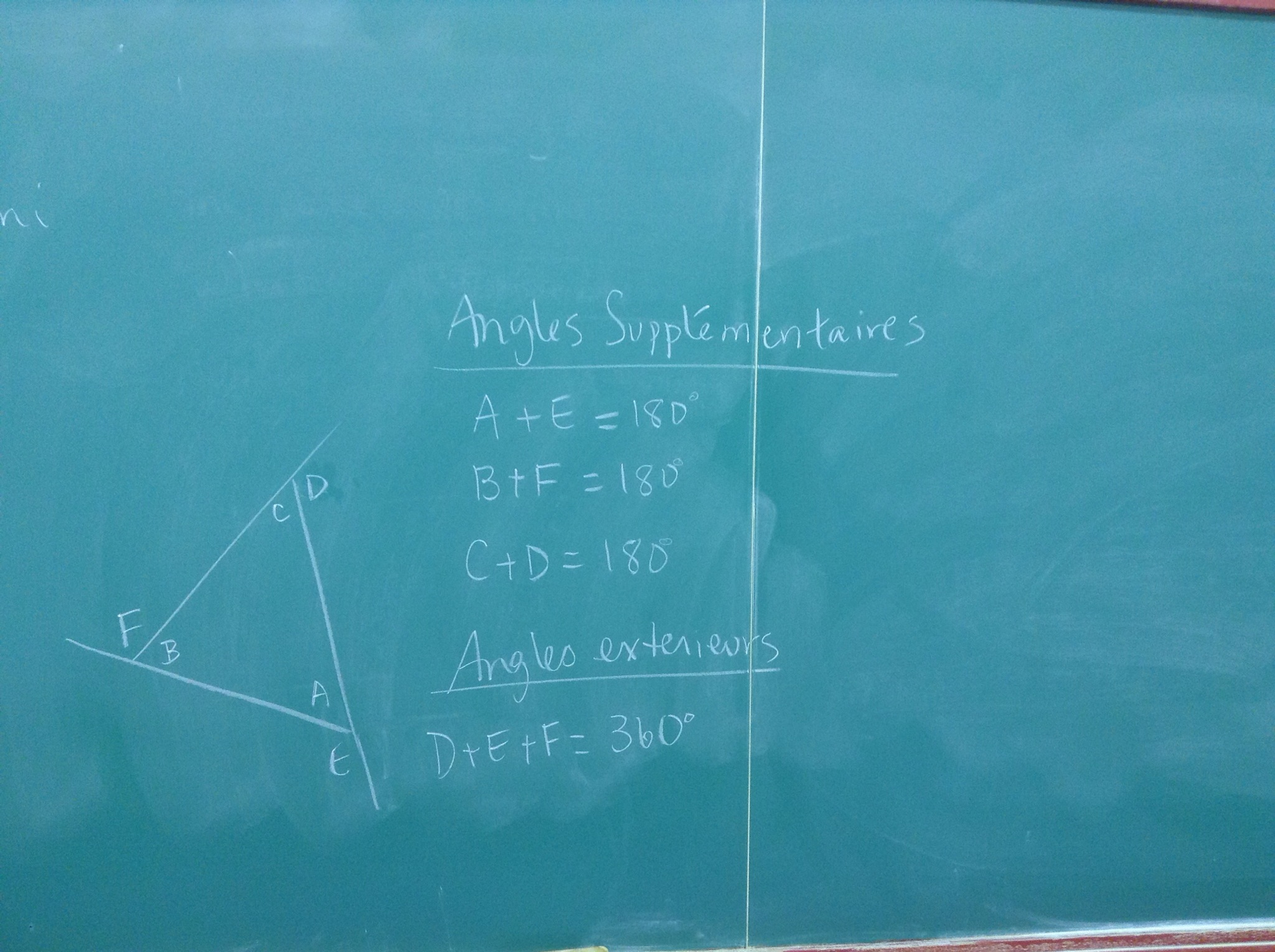
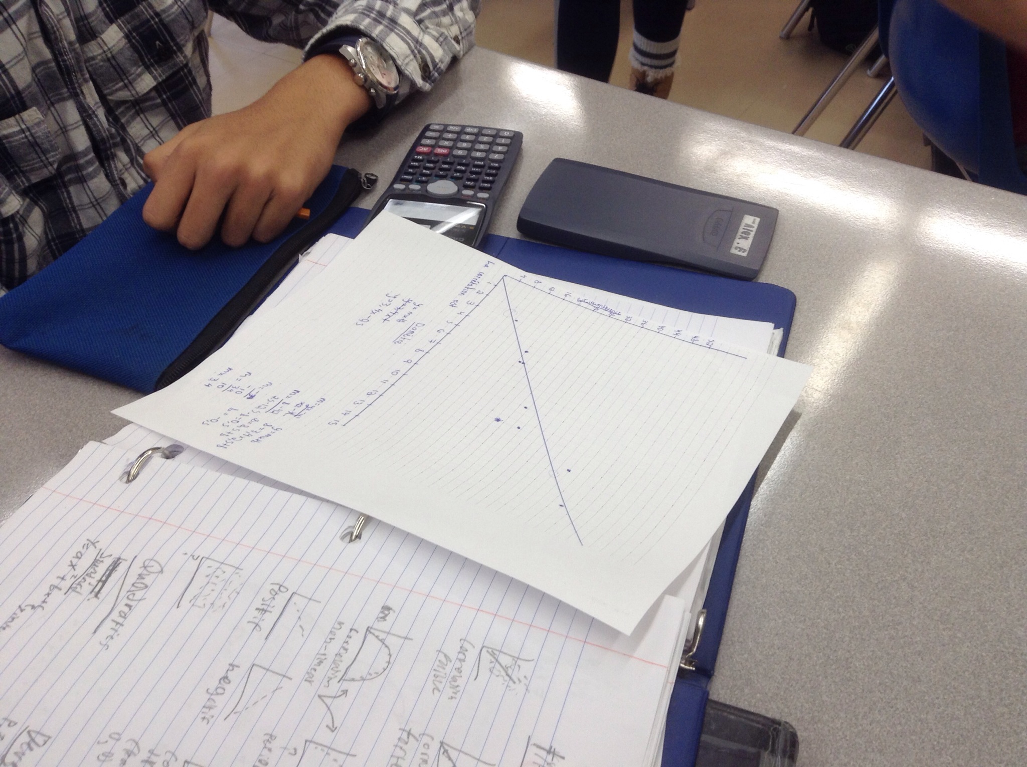
Triangles….for grade 9

Cutting the Cake

What’s the maximum number of pieces you can get if you cut a cake 20 times?
We modelled this problem in grade 10 with data, graphical, and algebraic models.
“Painted cube” problem
Today we modelled what we would find if we painted cubes made from different numbers of blocks. We looked at how many blocks would be painted on 3 sides, 2 sides, 1 side and not at all.

Some of us made lots of cubes. Others made models to show various parts of the question.


We saw patterns in the data, and determined equations to predict the number of blocks in each group given the dimensions of the original cube.
Exploring circles
Today in grade 9 we made circles out of string, measured the circumference, and measured the diameter.

We graphed diameter on the horizontal axis, and circumference on the vertical axis.

We looked at the line of best fit, calculated the slope and looked at the y intercept.
The correlation was strong, direct, linear, and positive. The slope was just more than 3, and we determined that the slope should be pi.
Some minds were blown.
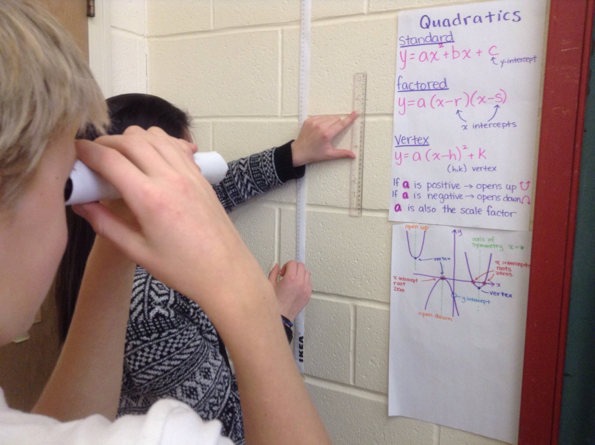
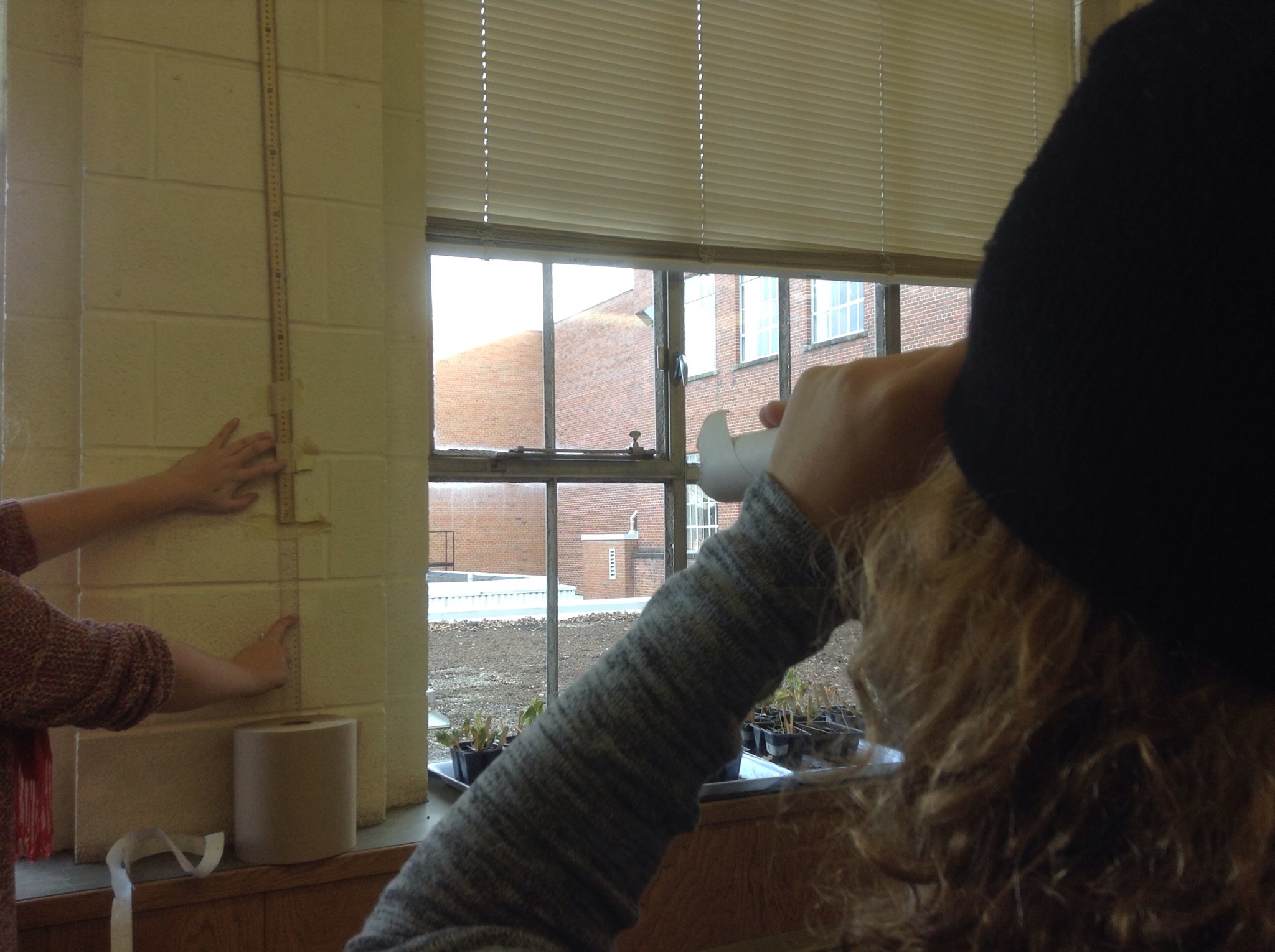
Looking Through Tubes
Today in grade 9 we investigated how our field of vision changes as we increase our distance from an object. To do this we used paper tubes, a few meter sticks, graph paper and desmos.com.
Each group of 3 had an observer, a measurer, and a recorder. The observer stands away from the wall and looks at a meter stick taped to the wall. The measurer records the distance to the wall, and also helps the observer determine the size of their field of view. The recorder puts all values in a table.
We created graphs and examined the correlation.
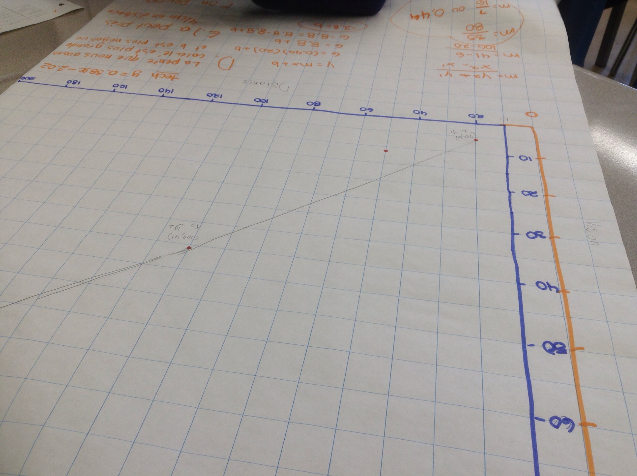
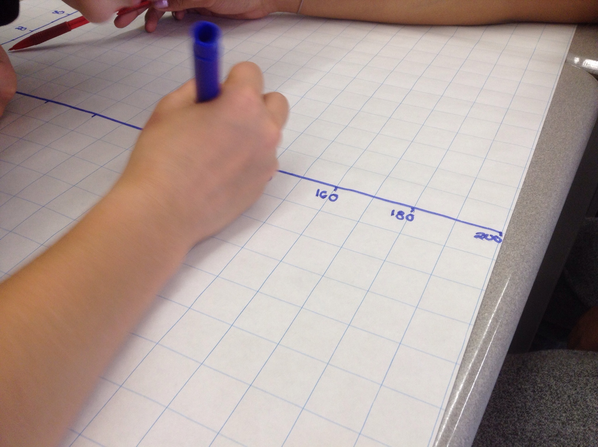
We drew a line of best fit, and calculated the slope and the y intercept.

We compared the equations to those that we got when desmos did a linear regression.
We could then make predictions and answer questions based on the best fit line (on the graph, and with the equation).
We’re getting ready for a summative investigation this Friday.
Desmos Lesson For Grade 10
On the PA day I learned a new trick that Desmos can do.
First of all, you can insert images onto axes, which is cool.

The next thing you can do is to model things seen in the image. For instance, the water fountain creates a parabola. We can play with various expressions until we get one that’s close. Give it a try. Add an expression in factored form y=a(x-r)(x-s). Play with values for a r and s until you make the graph fit.
Another way to approach this task is by regression. You can insert a table of values, and fill the x and y columns with points that would be on the parabola in the picture. Be sure there are at least 3 points in your table.
To get the curve of best fit we use a tool called a regression. You need to be careful of the syntax. Type y1~a(x1-r)(x1-s) the 1s included tell desmos that you are dealing with table of values 1. The ~ tells desmos to make the curve of best fit. A curve will show on your screen, and a legend will appear beneath your expression in the sidebar showing the values for a, r and s.
The same thing works for a line of best fit.

You could just play with y=mx+b until the line you create models he slope of the ramp shown, or you could make a table of values and do a linear regression. Insert a table of values, include at least 2 points, and then insert the following expression Y1~mx1+b and desmos will create the best fit line and equation to match.
This is a powerful feature! Graphs with desmos allow you also to easily interpolate and extrapolate too. Touch or click anywhere on the lines/curves created to get the exact coordinates. Intuitive, eh?
Using the program through the website allows you to sign in with your google account or desmos account, and save your graph. The app wont let you save yet.
Give it a try tonight. See what you can do.
